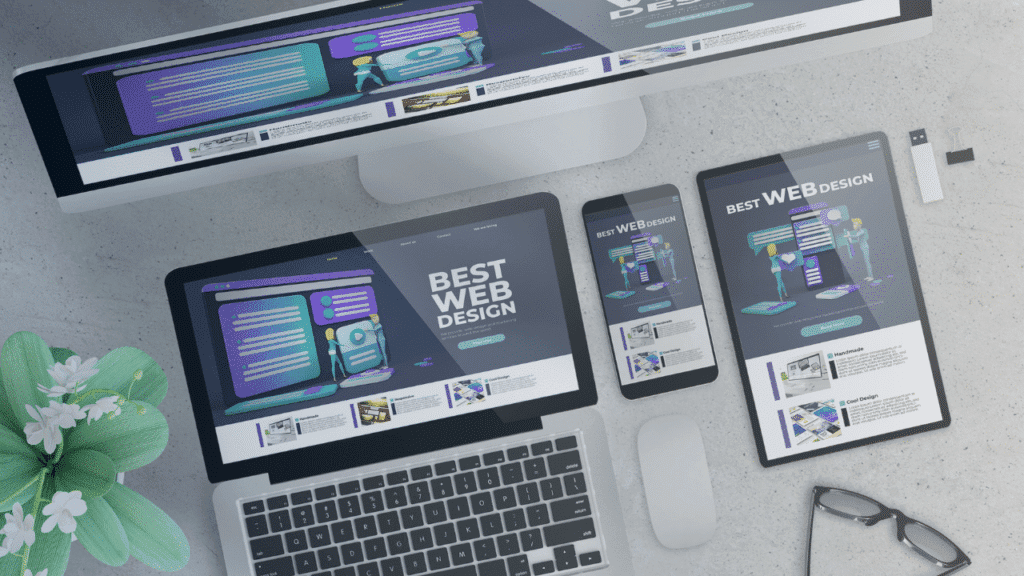
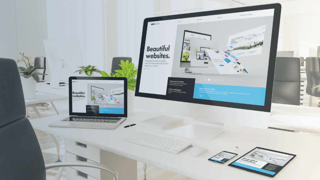
Responsive design is imperative for your website. With the increasing diversity of devices used to access the web, understanding the differences between responsive and adaptive design is crucial for optimizing your user experience.
Both design approaches aim to provide seamless visual and functional experiences, but they do so in distinct ways. This post will investigate into the key features, advantages, and disadvantages of each design strategy, helping you determine which option best suits your needs and enhances your audience’s engagement.
Key Takeaways:
- Responsive Design provides a fluid layout that adjusts to any screen size, ensuring a consistent user experience across devices.
- Adaptive Design utilizes predefined layouts for specific screen sizes, which can enhance performance by targeting specific resolutions.
- The choice between Responsive and Adaptive design depends on the project’s specific needs, audience, and desired user experience.

Understanding Responsive Design
The world of web design has evolved to prioritize user experience across devices, and responsive design is at the forefront of this shift. Responsive design refers to the approach of creating websites that provide an optimal viewing experience, easy navigation, and minimal resizing across a range of devices, from desktop monitors to mobile smartphones.
This technique utilizes flexible grids, layouts, images, and CSS media queries to adapt the web interface based on the screen size and orientation of the device being used. Ultimately, responsive design ensures that your site looks great and is user-friendly, regardless of how it is accessed.
Definition and Principles
With responsive design, the goal is to create a seamless browsing experience by allowing your website to automatically adjust its layout and content according to the viewport size. By using fluid grids, images, and responsive media queries, you can ensure that every user gets the most suitable version of your site. This strategy is built on a set of principles that promote flexibility and adaptability, making it possible for your website to cater to a diversified audience with varying preferences in device usage.
Advantages of Responsive Design
Responsive design offers many advantages that can enhance your website’s performance and usability. First and foremost, it simplifies your development process by allowing you to maintain a single version of your site that works across all devices, rather than managing multiple versions for different formats. This not only saves time but also ensures consistency in both design and content.
Additionally, a single responsive site improves SEO outcomes since search engines prefer sites that provide a seamless experience, regardless of the device. As a result, you can drive more traffic and increase engagement across all platforms.
Principles of responsive design enable you to create a more efficient user experience. By optimizing your site for various device sizes, you reduce the likelihood of users encountering issues such as difficult navigation or improperly formatted content.
This attention to detail fosters user satisfaction, encourages visitors to spend more time on your site, and can lead to higher conversion rates. By choosing responsive design, you’re not only investing in a modern aesthetic but also enhancing the functional aspects of your web presence.
Exploring Adaptive Design
Definition and Key Features
There’s much to discover when exploring into adaptive design. This approach focuses on creating customized layouts that respond to different screen sizes by delivering a fixed layout tailored to specific viewports rather than fluidly resizing elements.
Adaptive design typically uses breakpoints to determine the optimal structure for various devices, ensuring that users on smartphones, tablets, or desktops receive an experience that aligns with their screen size.
Key features of adaptive design include:
- Fixed layouts for targeted screen sizes
- Utilization of predefined breakpoints
- Improved loading speed due to optimized content for each device
- Consistent user experiences across different devices
- Ease of implementation for complex functionality
Thou can see how this focused approach aids in delivering an effective user experience for diverse devices and viewing contexts.
Advantages of Adaptive Design
The advantages of adaptive design are numerous, especially when you consider the range of devices available in today’s digital landscape. By focusing on distinct layouts for specific screen sizes, you provide an optimized experience tailored to the users’ needs on each device. This approach allows you to prioritize key elements and features, ensuring that the most critical information is accessible without unnecessary scaling or modifications.
Advantages of adaptive design encompass faster loading times, as the design is tailored to the limitations and capabilities of each device, thereby improving user satisfaction. Additionally, because adaptive sites deliver specific layouts, you can optimize individual user interactions based on device usage patterns, thereby enhancing usability.
Not only does this lead to improved accessibility, but it also allows for more effective marketing strategies targeted at different user demographics. This level of personalization can significantly improve engagement, conversions, and overall user satisfaction when interacting with your digital offerings.

Comparing Responsive and Adaptive Design
Your choice between responsive and adaptive design can significantly impact your website’s effectiveness. Both design approaches have their merits and drawbacks, making it vital to analyze them closely. Responsive design uses a fluid grid system, which allows content to adapt seamlessly across various screen sizes, while adaptive design employs multiple fixed layouts tailored to specific screen widths. The table below outlines key differences to aid your understanding.
Responsive vs. Adaptive Design
| Responsive Design | Fluid layouts that adapt to any screen size using CSS media queries. |
| Adaptive Design | Static layouts that are specifically designed for a limited number of screen resolutions. |
Performance and User Experience
Behind the scenes, responsive designs tend to offer a more fluid user experience, as they adapt in real time to any screen size. This can create a more cohesive interaction for users who navigate between devices like smartphones, tablets, and desktops. Conversely, adaptive designs may excel in scenarios where specific content is optimized for specific devices, potentially providing a faster load time due to reduced resource delivery tailored for that resolution.
Development and Maintenance Costs
Between responsive and adaptive design, the development and maintenance costs can vary considerably. Responsive designs often incur a slightly higher initial setup cost due to the necessity of creating flexible layouts and testing across a wide range of devices.
However, once established, they typically require less ongoing maintenance as the same codebase can cater to multiple devices. Adaptive design, on the other hand, often requires separate layouts for different devices, which can inflate both development time and costs, needing more frequent updates as new devices enter the market.
To optimize your budget for either design approach, consider the long-term implications. While responsive design may require a larger upfront commitment, its ability to service a variety of devices through a single codebase can lead to lower maintenance costs in the future. Adaptive design might be suitable for projects with highly specialized user requirements, but be prepared for ongoing adjustments as device specifications evolve.
Case Studies: Real-World Examples
Keep in mind that analyzing real-world examples can help you better understand the practical applications of responsive versus adaptive design. Here is a detailed list of case studies showcasing the effectiveness of both design strategies:
- Amazon: Implemented responsive design features leading to a 20% increase in mobile sales.
- BBC: Transitioned to responsive design, resulting in a 50% increase in the mobile bounce rate reduction and a 20% increase in page views.
- Airbnb: Used adaptive design to provide tailored experiences for different devices, which resulted in a 25% increase in user engagement.
- Etsy: Adopted responsive design, resulting in a 30% growth in mobile transactions.
- Microsoft: Leveraged adaptive design for Outlook, achieving a remarkable 15% decrease in user churn.
For a deeper examine the nuances of these methods, consider checking out Choosing Adaptive vs. Responsive Web Design, which provides insights into the key differences that might influence your decision-making process.
Successful Responsive Design Implementations
One excellent example of successful responsive design implementation is the website for Salesforce. By opting for a fully responsive layout, Salesforce improved their mobile user experience significantly, resulting in a reported 45% uplift in conversion rates across devices. Their site fluidly adapts to various screen sizes, ensuring that users can access the full range of features regardless of whether they’re on a desktop or a smartphone.
Another notable case is Spotify, which employs responsive design for their platform. By adapting their website to provide an engaging experience for both desktop and mobile users, they’ve seen an increase of over 60% in mobile app downloads. This success illustrates how effective responsive design can capture user interest and facilitate smoother navigation across devices.
Successful Adaptive Design Implementations
Around the world, many companies have found success with adaptive design strategies. For instance, YouTube utilizes adaptive design principles to optimize their platform for various devices. This allows them to cater to specific user contexts, enhancing load times and performance. Their adaptive approach has led to a decrease in video buffering by 35%, improving the viewing experience across a variety of connections and devices.
Further, Target adopted adaptive design to create a seamless shopping experience for their customers. By detecting device type and adjusting the layout accordingly, Target achieved a 50% increase in mobile sales during peak shopping seasons. Adaptive design has enabled them to effectively display products tailored to device specifications, maximizing user satisfaction and boosting revenue streams.
Best Practices for Implementing Design
Not every design approach is suitable for every project, so it’s imperative to consider your specific needs and goals before diving in. Assess your target audience, the devices they use, and their browsing habits. This understanding will help you identify whether a responsive or adaptive design is more suited for your website. Consider factors such as the complexity of your content, load times, and how quickly you want to implement changes. Ultimately, choosing the right design strategy can greatly impact the overall user experience and functionality of your site.
Choosing the Right Approach
Around this process, involve stakeholders and get feedback to ensure that the design aligns with business objectives. For instance, if performance on mobile devices is a priority, you may need to lean towards a more adaptive design to optimize load times and functionality. Conversely, if you want a more fluid layout that adjusts dynamically to various screen sizes and orientations, responsive design may be your ideal choice. Each approach has its advantages and disadvantages, so make sure you weigh them carefully based on your project requirements.
Tools and Technologies
Technologies continue to evolve, providing you with various options to implement either responsive or adaptive design effectively. Familiarize yourself with CSS frameworks like Bootstrap or Foundation, which offer grid systems and pre-built components that simplify responsive design.
There are also JavaScript libraries that help in enhancing adaptive interfaces, such as Modernizr, which allows you to tailor designs based on browser capabilities. Moreover, leveraging design software like Adobe XD or Sketch can aid in creating prototypes to visualize how each approach will look and function on different devices.
Right tools can streamline your design process, allowing you to manage media queries, creating flexible grid layouts, and incorporating breakpoints effectively. Utilizing these technologies will not only enhance your workflow but also improve the quality of your final design, ensuring that your website delivers a seamless experience across all devices. By staying current with the latest tools and best practices, you can make informed decisions that lead to a successful implementation of your chosen design approach.
Future Trends in Web Design
Many web designers are aware that technology is constantly evolving, and this trend is no different in the world of web design. As you navigate the ever-changing landscape, it’s vital to stay updated on emerging tools and frameworks that can enhance user experience. Whether you’re leaning towards responsive design or adaptive design, understanding how modern browsers and devices are evolving will help you make informed decisions. For more insights on the distinctions between these design strategies, check out What is the difference between responsive and adaptive ….
The Evolving Landscape of Web Technologies
Trends suggest that as more users access the internet via mobile devices, the need for efficient and highly functional design frameworks will grow. You might notice that more web applications are adopting progressive web app (PWA) principles, which enhance both responsive and adaptive design strategies. This shift allows for seamless user experiences that adjust based on device capabilities, promoting a more versatile web environment. Innovations in coding techniques and design principles, such as CSS Grid and Flexbox, are also influencing how you structure your layouts for better adaptability to various screen sizes.
Predictions for Responsive and Adaptive Design
After examining industry trends, it is clear that both responsive and adaptive design will continue to have significant roles in the future of web design. As you plan your next project, consider focusing on hybrid approaches that blend the strengths of both methodologies. As technology advances, your designs will likely need to incorporate AI and machine learning to cater to personalized user experiences for different devices. This will enable you to stay ahead of the curve and address users’ needs more effectively.
Design strategies will increasingly prioritize performance and accessibility alongside aesthetics. The growing awareness around user experience means that you should fully integrate responsive and adaptive elements to ensure your site is both user-friendly and efficient. By exploring various technologies, frameworks, and methodologies, you’ll be better equipped to create an engaging, functional web experience that resonates with your audience.

To wrap up
Now that you’ve explored responsive and adaptive design, it’s clear that the best approach ultimately depends on your specific needs and context. If your primary goal is seamless user experience across a wide range of devices, responsive design may be the ideal solution for you, due to its flexibility and fluidity. On the other hand, if you are targeting particular devices or want to optimize performance for different screen sizes, adaptive design could better serve your objectives by allowing you to offer tailored user experiences.
In deciding between these two methodologies, you should assess your audience’s behavior, the types of devices they use, and the specific content you wish to deliver. Consider your design goals and the resources available for implementation and ongoing maintenance. Ultimately, both responsive and adaptive designs can coexist, and integrating elements of both might even provide an optimal solution that meets your users’ diverse needs while enhancing engagement and satisfaction.
FAQ
Q: What is the main difference between responsive and adaptive design?
A: The primary difference lies in how each design approach adapts to various screen sizes. Responsive design uses fluid grids and flexible images that adjust dynamically based on the size of the device’s viewport. This means that a single layout can work across all devices, providing a seamless experience. In contrast, adaptive design employs fixed layouts tailored for specific screen sizes, often detecting the device and serving an optimized version accordingly. This can lead to faster load times on certain devices but may require multiple layouts to be created and maintained.
Q: Which design approach is better for SEO?
A: Both responsive and adaptive designs can be optimized for SEO, but responsive design has a slight edge. Since responsive design utilizes a single URL for all devices, it simplifies the indexing process for search engines, making it easier for them to understand the content. This can lead to improved rankings. On the other hand, adaptive design might require additional efforts to manage multiple URLs for different layouts, which may complicate SEO strategies. However, with proper implementation, adapted sites can also achieve good search engine visibility.
Q: How do I decide which design approach to use for my project?
A: Deciding between responsive and adaptive design depends on the specific needs of your project and your target audience. If your site requires a consistent experience across a wide range of devices and resolutions, responsive design may be the better choice. It reduces maintenance efforts since you’ll only need to manage one layout.
However, if you know your audience primarily uses a few specific devices, adaptive design might be more effective, providing tailored experiences that can optimize performance and engagement on those devices. Assess your goals, user demographics, and available resources to make the best choice.


